WAEMU in figures
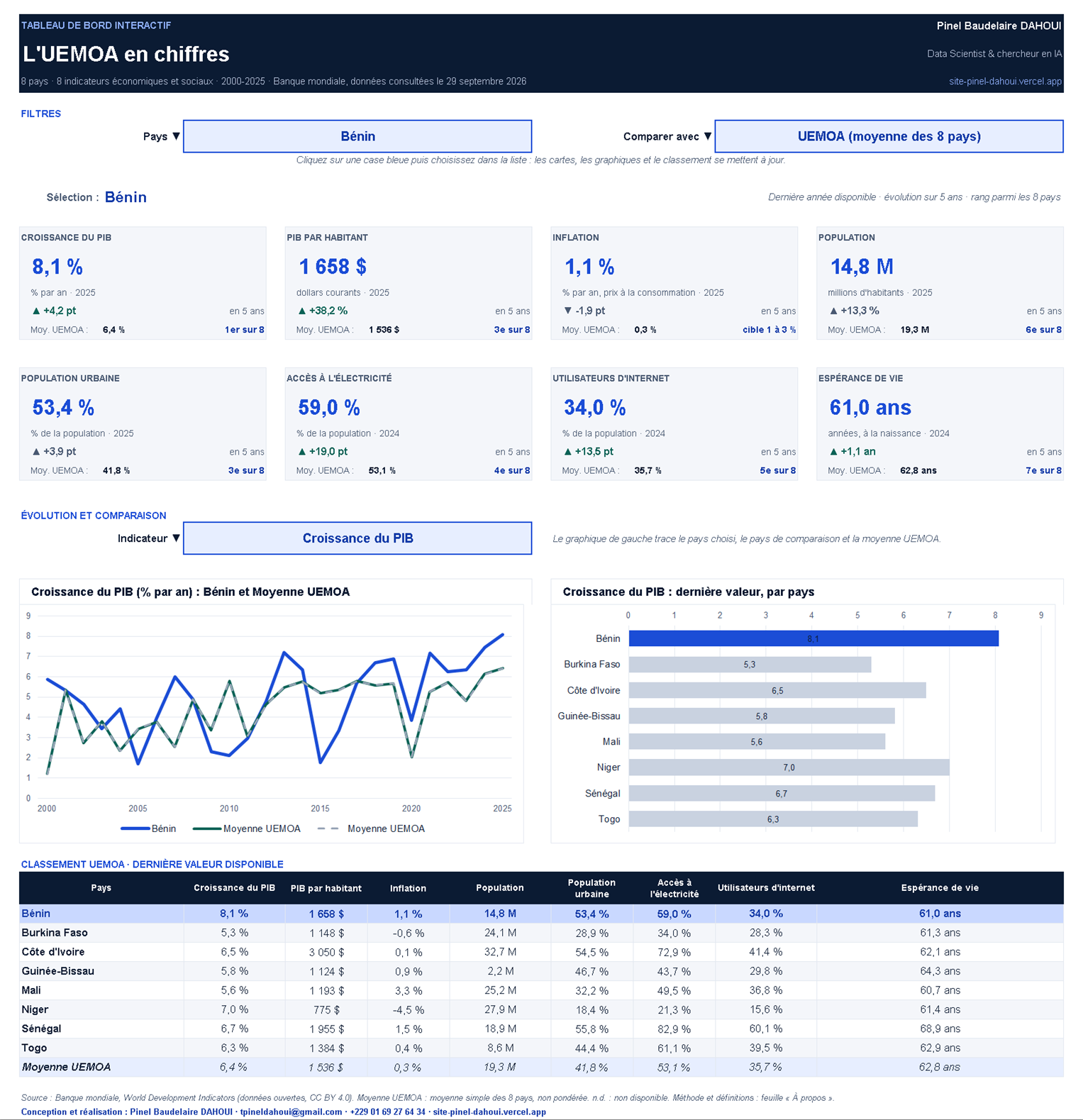
A dashboard built on real World Bank data, from 2000 to 2025. Three filters drive everything: pick a country, a comparison country and an indicator, and the KPIs, charts and ranking update instantly. The file itself is in French.
 View the preview full size
What the file contains
- Three filters
Country (or WAEMU average), comparison country and indicator: simple drop-down lists that drive the whole dashboard, whatever software you use.
- 8 KPIs per country
Growth, GDP per capita, inflation, population, urbanisation, electricity, internet and life expectancy, with the 5-year change, the WAEMU average and the country’s rank.
- Two dynamic charts
The trend since 2000 for the selected country against the comparison country and the WAEMU average, and a comparison of the 8 countries for the chosen indicator.
- Traceable data
All series by country and year (2000-2025), official definitions and the source are included in the file, ready to reuse.
A dashboard for your organisation?
Your own KPIs
Sales, field activity, project monitoring and evaluation, survey data: the indicators that matter to you, in one place.
In the tool you already use
Excel, with no macros or software to install, or a web dashboard if your needs require it.
Reliable and documented
Cited sources, verifiable calculations and simple updates, just like this project.